Viztober Fest gives HBS staff the opportunity to display their stunning graphs, charts, dashboards, and other data visuals. It’s a chance to connect with other data-loving colleagues and share knowledge.
Viztober Fest gives HBS staff the opportunity to display their stunning graphs, charts, dashboards, and other data visuals.
Viztober Fest is more than a showcase—it’s a community gathering. Wander from display to display, spark conversations with colleagues, and discover the diverse ways data is being leveraged across HBS. Whether you come to get inspired, swap ideas, or simply admire the creativity of the visuals, it’s a chance to celebrate how data connects us all.
Have a data visualization you want to highlight to others? Are you really proud of something you made in Excel, Tableau, Datawrapper, or an AI tool? Here’s your chance to amplify and celebrate your amazing work poster session style!
Individuals who participate in the showcase must be present at the event to run their visualization on their laptop.
Your Visualization CAN...
Be related to any topic
Yes
Be made using any software, including AI
Yes
Be a passion project (aka not related to work)
Yes
Be static or dynamic
Yes
Be amateur, experimental, or incomplete
Yes
Your Visualization CANNOT...
Contain underlying data that is sensitive, private, or otherwise unsuitable for a non-HBS audience
No
Violate the permitted Use of Electronic Resources if using Baker Library licensed content
No
Have photo restrictions
No
Submission Deadline & Instructions
The deadline to submit a visualization is 5:00pm on Monday, 10/19/26. In your submission, please include the following:
A title for the visualization
A short (2-5 sentences) description of the visualization
A link to the visualization OR an image attachment of the visualization
Largest Minority/Women-Owned Businesses in MA by Revenue
The visual contains 10 years worth of data from The Book of Lists. It highlights the impact and changes across the top minority/women-owned businesses in MA. It wasn’t until 2021 that women were given their own separate list.
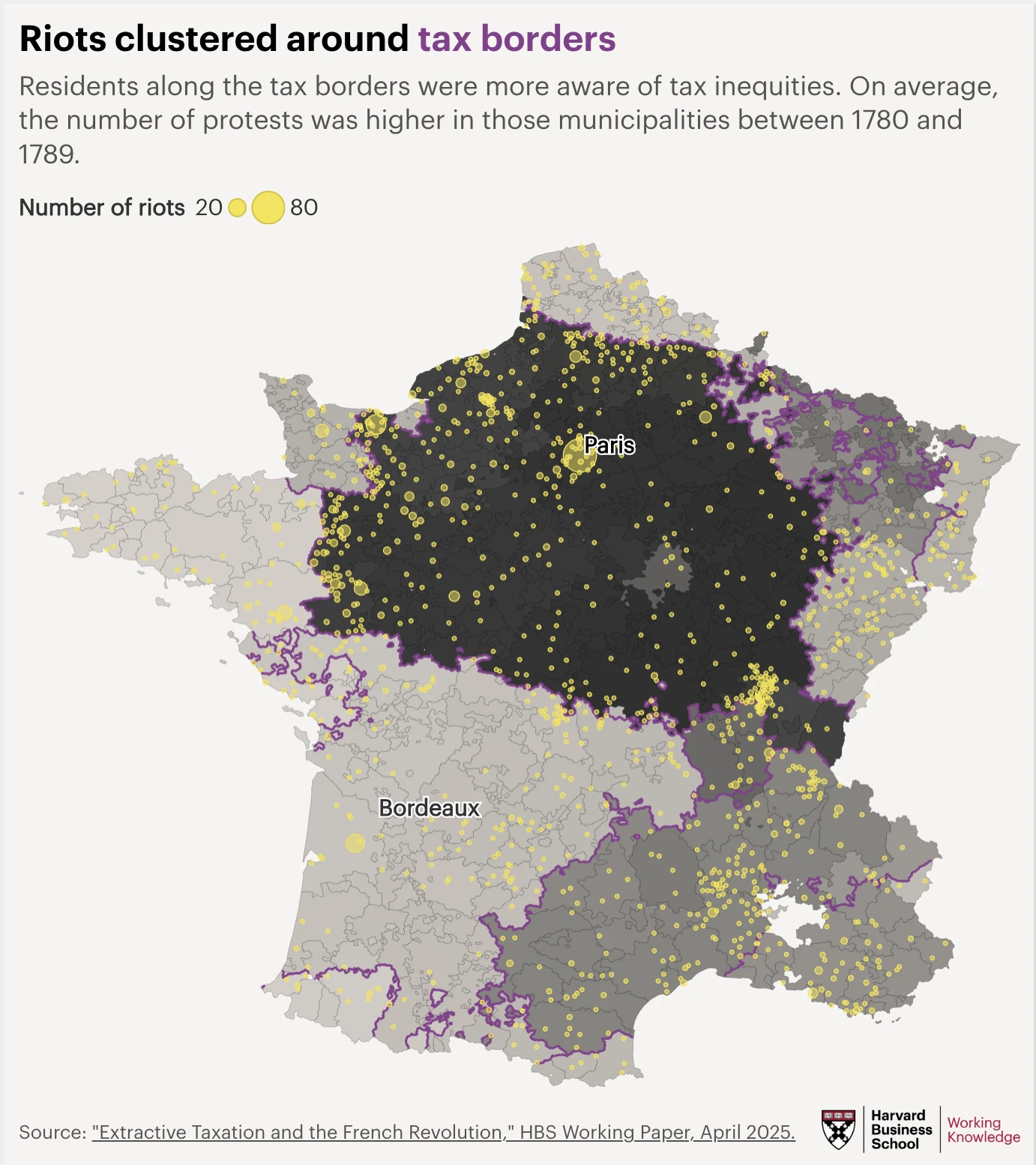
Mapping the Salt Tax That Helped Shatter a Monarchy
This map shows how riots clustered around tax borders just before the French Revolution. Some municipalities, like those near Paris, faced much higher taxes than others, such as those near Bordeaux. The data and original maps come from research by HBS professor Marco Tabellini.
.png)